
SelfManager.ai v4 is live: a ground-up redesign of the daily planner I have been building for 9 years
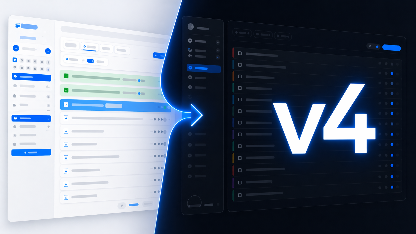
I have been building SelfManager.ai solo since 2016. That is more than 3,000 commits, dozens of features, and one consistent idea: instead of organizing your life around projects and boards, organize it around dates.
Today I am shipping v4. It is the biggest update since the app went online.
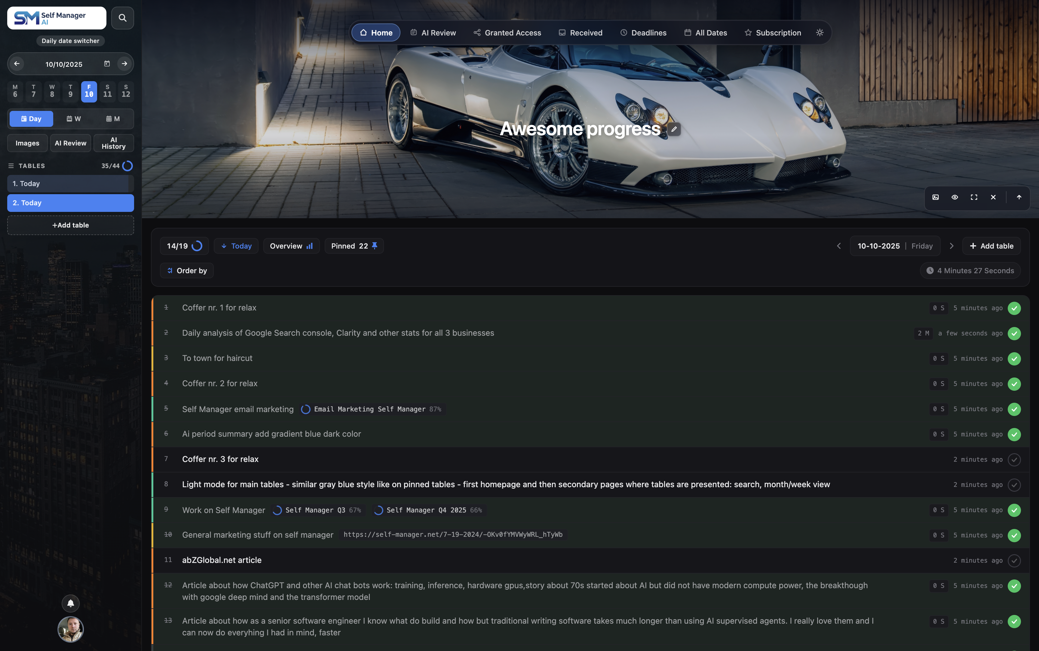
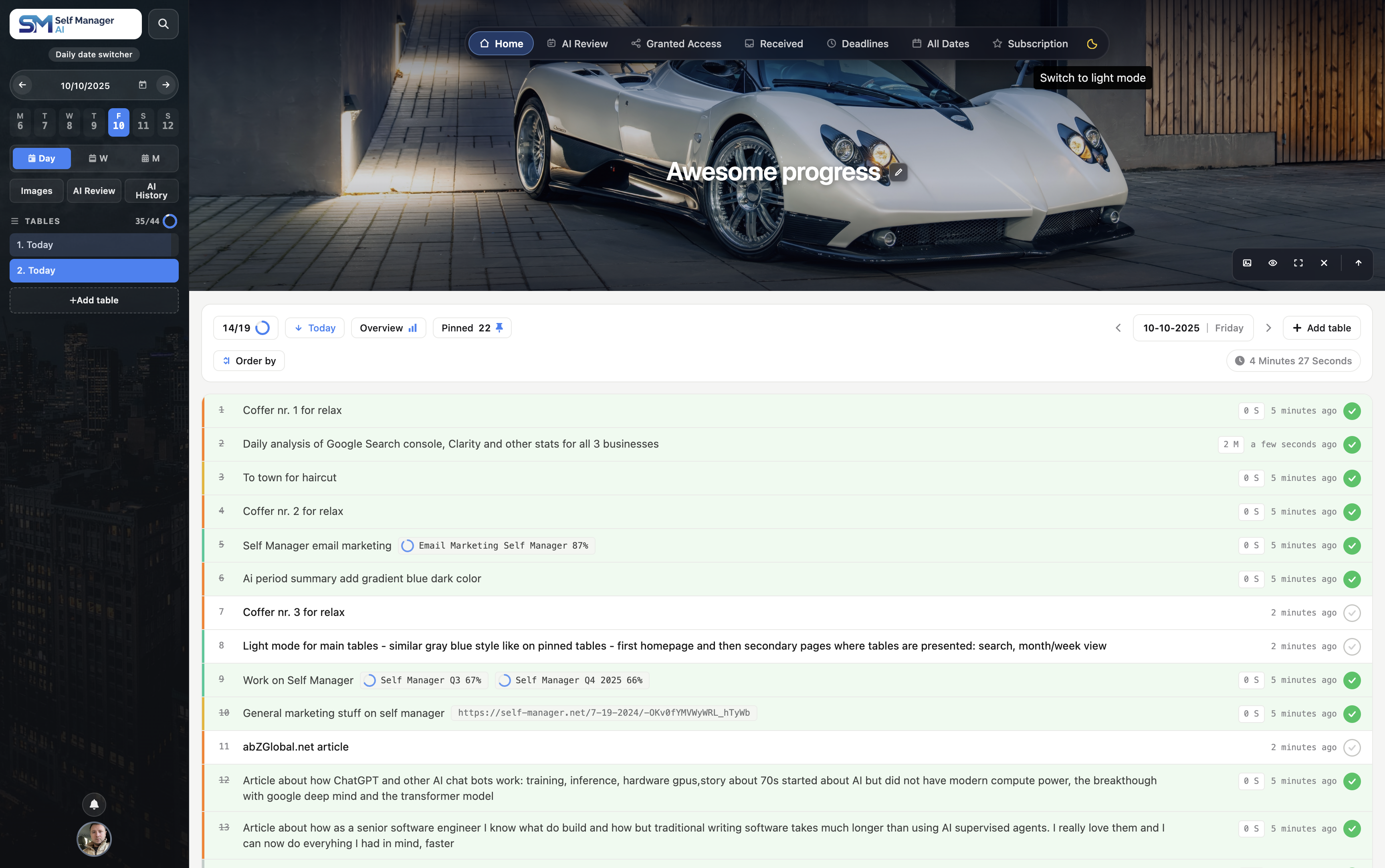
This is not a theme refresh. It is a full rebuild of the entire logged-in experience — desktop, mobile, light mode, dark mode, every modal, every dialog. If you have used SelfManager before, the first time you log in to v4 will feel like opening a different app.
Here is what changed, and why I rebuilt instead of patched.
Why a full redesign instead of incremental updates
Every long-running product reaches a point where small fixes stop compounding. You end up with a UI made of archaeology — every screen reflects a different era of decisions, a different idea about color, spacing, and hierarchy.
SelfManager hit that point a few months ago.
The core idea of the product still works. Users live in the app every day, planning, tracking, and reviewing. But the surface they touched had drifted. Mobile felt like an afterthought. Notes were a plain textarea. Light mode worked on some pages and not others.
I needed a clean visual language that would scale from a 27-inch monitor down to a 375-pixel phone, support both themes properly, and give me room to ship the next two years of features on top of a coherent base.
v4 is that base.
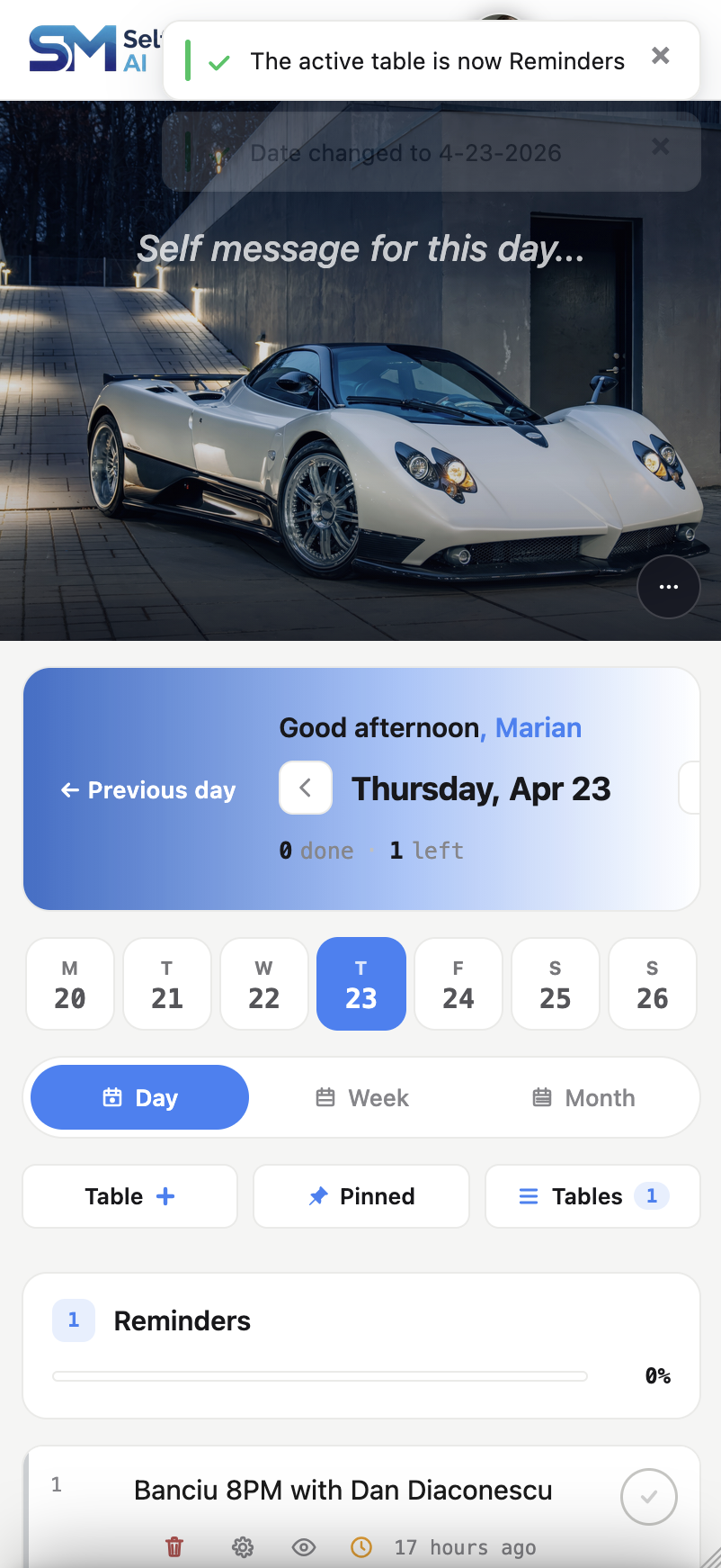
Mobile feels native now
This is the change I am most proud of, and the one most users will feel first.
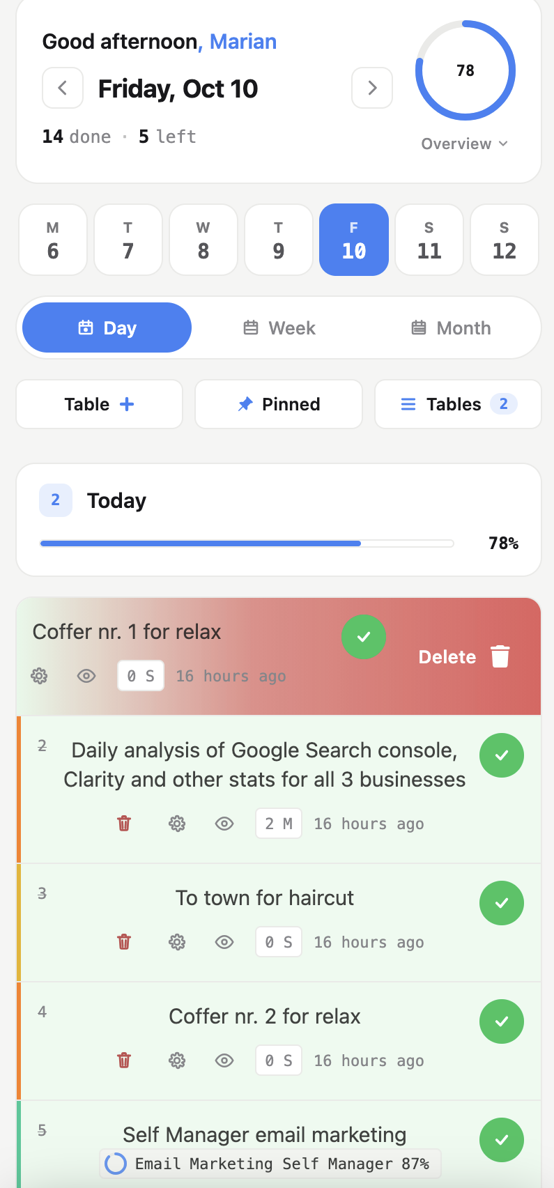
The old mobile experience was responsive CSS over a desktop layout. It worked, but it never felt like a phone app. v4 ships a dedicated mobile architecture with a proper gesture layer.
At the top of the screen, swipe left or right on the date header to move to the next or previous day. No more tapping arrows or scrolling to find the date switcher — your day jumps with one motion.
On any task row:
- Swipe right opens its settings.
- Swipe left deletes it, with a confirmation step.
- Double-tap toggles the task between complete and not-started.
- Long-press on the task text triggers your operating system's text selection and pops up a highlight marker, so you can color-code specific words inside any task.
The gesture layer tracks your finger 1:1, with a slight rubber-band effect when you drag past the edges and a subtle haptic pulse the moment you cross the commit threshold. It also defers to the operating system whenever you are trying to scroll vertically or select text — the gestures get out of the way instead of fighting you.
Smaller mobile improvements that add up: the timer now lives on its own row so you can read it at a glance, the profile picture loads from cache instantly, and the seven-day strip fits cleanly on every phone including iPhone SE.
Notes are a real editor now
The notes feature used to be a plain textarea. That is gone.
v4 ships a real rich-text editor with everything you would expect from a modern notes app:
- Bold, italic, underline, strikethrough
- Headings (H2 and H3)
- Bullet and numbered lists
- Inline links with a proper URL input
- Inline code
You can paste from Word, Google Docs, or anywhere else and the formatting gets sanitized automatically. Auto-save can be toggled on, and your preference syncs across devices. There is version history with previous and next navigation, plus a live word count.
One technical decision worth mentioning: the editor only loads when you actually open a note. If you do not use notes, you do not download the editor bundle. The rest of the app stays fast.
Light mode that works everywhere
Light mode existed in earlier versions, but it stopped at the homepage. Once you opened the subscription page, a settings dialog, or certain authenticated views, the dark surfaces would bleed through.
v4 fixes that completely. Every authenticated surface now respects the theme — modals, dialogs, the login screen, drag-and-drop indicators, the subscription banner, every piece of chrome.
If you are a light-mode user, this is the update that will make the app feel finished for the first time.
The first customization layer — overlays, drag-resize, and a collapsible sidebar
One of the consistent asks over the years has been: let me change things. The tint over my hero photo. How wide the sidebar is. Whether the sidebar is there at all. v4's clean foundation let me ship the first real layer of personalization without turning the app into a theming project.
Collapsible sidebar. Hit ⌘B (or Ctrl+B on Windows) or click the chevron at the bottom-right of the sidebar and it slides off-screen. A small restore arrow pins to the left edge of the viewport so getting it back is one click. The preference syncs across devices. If you want a wider canvas for tables, you always have it.
Drag to resize. On desktop, grab the bottom edge of the hero or the right edge of the sidebar and drag. Both have sensible bounds — the hero goes from 160 to 1000px, the sidebar from 236 to 800px — and the size persists. The hero size picker gains a "Custom" row that shows you exactly which pixel value you landed on; clicking any of the built-in Small / Medium / Large options clears the custom size and snaps back to the preset.
Per-theme overlay tint. Both the sidebar background image and the hero image now have their own tint color + opacity, edited independently for dark and light mode. Find them under Profile → Sidebar Overlay and Profile → Hero Overlay. Six presets cover the common picks; the native color picker handles everything else. Each section is collapsed by default so the profile modal stays tight when you are not touching it.
Per-platform hero size. Until now the hero size picker was a single preference shared between desktop and mobile, which was always a compromise. v4 splits them: your desktop can stay on "Tall" (room for a full sentence of text across the top) while mobile runs "Compact" (more vertical room for the day's tables). The two sides no longer fight each other.
Top nav pill themes correctly over hero images. Small fix, visible difference — previously the nav pill stayed dark-glass even when the rest of the app was in light mode and your hero photo was bright. It now switches to a frosted-white pill with dark text, matching the rest of the light theme. The dark mode glass stays as-is.
What did not change
The product itself. The core idea is identical to what it was in 2016: one day as a container, unlimited custom tables inside it. You plan your day. You track what you did. You keep your thinking in one place.
That model has not changed in 9 years and it does not change in v4. What changed is the surface you touch every day, and how much friction is between you and the work.
What this means if you are an existing user
Nothing for you to do. Log in and everything is live. Your data, tables, notes, and subscription are all unchanged. You will just notice that the app looks different and feels tighter.
If something seems off, the contact form is at selfmanager.ai/contact and I read every message personally. Real-world usage always surfaces things that testing misses, especially on mobile.
What this means if you tried SelfManager before and left
This is probably the version that was missing.
A lot of people signed up over the years, did not connect with the old interface, and never came back. If you were one of them, the app you tried and the app today are not really the same product visually. The mobile experience in particular is a different category of polish than what was there even six months ago.
Your account is still there if you want to look again.
What is next
v4 is the base. The unified design system, the mobile gesture layer, the proper notes editor, and the consistent theming were all preconditions for the next round of features. Now that the base exists, the next two quarters get faster.
I will not pre-announce specifics, but the broad direction is more AI features that actually save you time during planning and review, deeper integration between dates and goals, and lighter ways to capture things into the system without breaking flow.
If you want to follow along, the SelfManager About page has a running quarterly log of what shipped and when.
Try v4
9 years. 3,000+ commits. The version SelfManager always wanted to be.
— Marian Sorca
Founder/CEO/CTO, SelfManager.ai
Date-based AI Task Manager
Plan smarter, execute faster, achieve more
Create tasks in seconds, generate AI-powered plans, and review progress with intelligent summaries. Perfect for individuals and teams who want to stay organized without complexity.
Get started with your preferred account